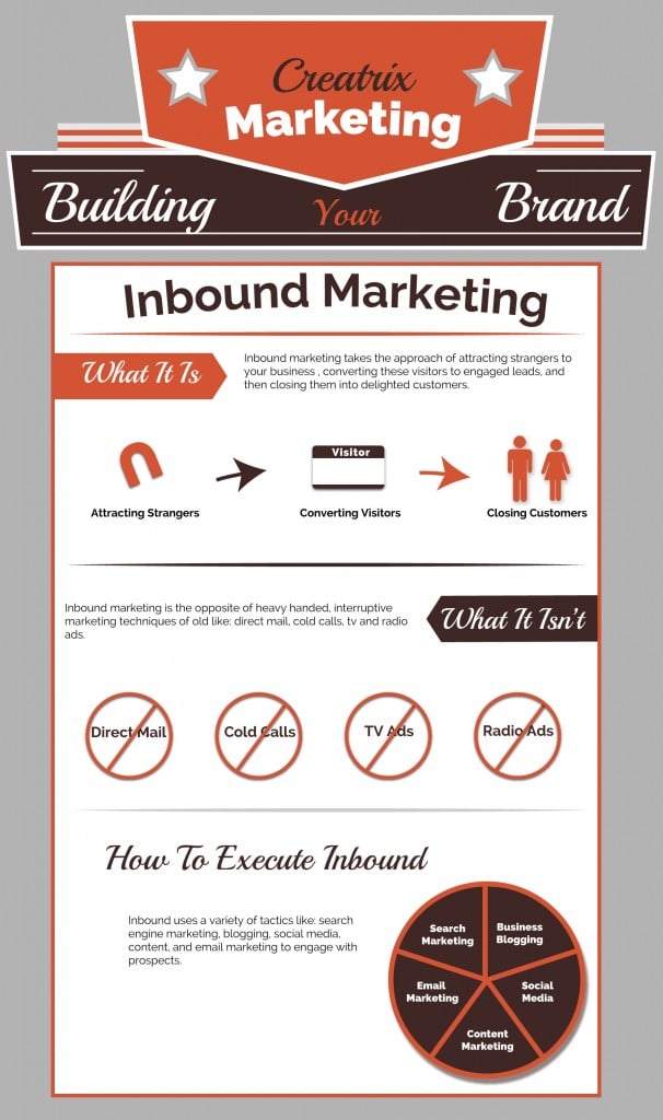
I’ve never met an infographic that I didn’t like. Even clunky renditions with bad fonts and unbalanced graphics have the potential to concentrate complex issues into potent, bite-size snacks of information. Which, is exactly why I have become such a fan, and why you should become one too. The “content is king” manifesto is still holding court in the world of digital marketing; infographs are an eye-catching and effective way to get information out about your business and its products and services.
In fact, infographics provide a unique portal into the current media landscape: “With the overload of printed and digital media, infographics can be a powerful way to tell your company’s story,” says expert visual tool designer, Jonathan Pavoni, who founded Creatrix Marketing.
It’s hard to imagine that anyone out there in cyberspace has not yet discovered this must-have inbound marketing tool, but many people still either don’t like them, or can’t envision how their business’ product or services would translate. For this crowd, I present Infographics 101, a link that once you get there, needs zero explanation.
Even an infographic lay[wo]man like me knows they’re easy to understand, fun to look at and people love sharing them—just take a look at my Pinterest page, where I often share my favorite, or most reliable, infographs. In this era of fast-paced content bombardment, a cleverly crafted, colorful and readable “instant” message has unrivaled ability to grab a customer or client’s attention.
Says Pavoni, “[They] force businesses to boil down their services and story. At the same time, they allow companies to show a bit of personality and have a little fun.” Highly saturated information in a single, eye-pleasing place allows writers of company blogs, eNewsletters, eBooks and white papers to catch their breath.
Reasons to use infographics:
- 90% of information transmitted to the brain is visual, and visuals are processed 60,000x faster in the brain than text
- Publishers who use infographics grow in traffic an average of 12% more than those who don’t
- Visual content drives engagement. In fact, just one month after the introduction of Facebook timeline for brands, visual content—photos and videos—saw a 65% increase in engagement
- Pinterest (visual content) generated more referral traffic for businesses than Google+, YouTube, and LinkedIn combined.
- Infographs are popular on twitter (as are “inline” images, which generate nearly 90% more “favorites”)
- Viewers spend 100% more time on pages with videos on them.
- People love facts, figures and statistics
- Viral potential is higher than for ordinary text content
- Can be embedded into blog and websites via an embed code that automatically links from others’ to yours, driving traffic to your website as people “share” and “click.” This, in turn, can benefit SEO ranking (more people linking to your site can lead to a higher Google rank).
- For consumers suffering from content overload, infographs deliver sharable, digestible content
At the end of the day, I have to agree with Pavoni: “It’s much easier to connect with potential customers when they can glean, right away, what your business is about, and what you can do for them.”
Blogger Notes: This post was co-written with the warden ettinger group’s amazing Temple University intern, Emily Spring.


