Brought to you by Functionize:
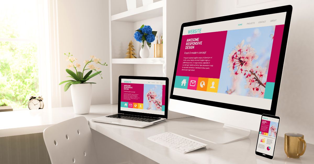
Creating websites that look great on every device and browser can be a real challenge. With so many different screen sizes and browsers out there, it’s important to know how to maintain consistency. Whether you’re building a site for desktop, tablet, or phone, keeping a seamless look across all platforms should be a top priority. A well-executed responsive design adapts fluidly to any screen size, which helps provide a smooth user experience.
One way to achieve consistency is through using tools that check how your designs appear in different environments. These web browser testing tools can help you find issues before your audience does, as they simulate various browsers and screen sizes, allowing you to spot any problems that might occur. This proactive approach helps ensure your site functions correctly no matter where it’s viewed.
Additionally, implementing flexible grids and layouts can make a big difference. By using units like percentages rather than fixed values, your design can adjust naturally to different screen sizes. These strategies not only help maintain the visual integrity of your website but also ensure it performs well for every user.
1. Understanding Fluid Grids
Fluid grids use a flexible layout structure that enables web designs to resize seamlessly across various screen sizes. Instead of fixed-width layouts, fluid grids use percentages for columns, allowing them to adjust fluidly with the browser window. This approach makes designing for unknown screen sizes easier and keeps elements in proportion, regardless of the device.
Fluid grids provide the foundational framework for responsive web design, ensuring a consistent user experience across different devices. By adopting this method, you optimize the layout for both small mobile devices and large monitors, offering a smooth transition and accessibility.
2. Implementing Flexible Images
Flexible images automatically scale to fit the width of their container. This prevents images from overflowing the layout on smaller screens or looking pixelated on larger ones. Use CSS to set images to scale based on the surrounding elements.
One common technique is setting the image width to a percentage, like max-width: 100%, to maintain proportions across different devices. This keeps the visuals clear and sharp without distortion.
Always ensure images are high-quality, not only to look impressive but to provide a visually consistent experience. Testing on different devices will help you adjust image properties effectively.
3. Utilizing Media Queries
Media queries allow you to apply specific CSS styles based on screen characteristics such as width, height, and orientation. This capability is important for creating designs that can switch and adapt their look or layout for different devices.
You can use media queries to change the site’s design or elements’ visibility when viewed on various screen sizes. For example, you might hide navigation menus on smaller screens or increase text size for readability. By leveraging media queries, you guarantee that each user gets an optimal and tailored experience, regardless of their device or browser, which is a core aspect of responsive design.
4. CSS Resets and Normalization
CSS resets and normalization guarantee consistent styling by neutralizing browser defaults. This is important because browsers apply their own styles to HTML elements, leading to inconsistencies. CSS resets strip away these styles, creating a blank canvas.
Normalize.css, for instance, keeps useful defaults while smoothing out differences. Implementing these techniques requires resetting or normalizing stylesheets in your project. This helps maintain the same look across browsers, improving user experience. Begin by identifying which method suits your project’s needs, then integrate it into your stylesheet.
5. Feature Detection and Polyfills
Browsers often differ in how they support web technologies. Feature detection allows you to check if a browser supports a feature before using it. Tools like Modernizr can automate this by triggering specific code paths.
Polyfills provide missing features by replicating them, guaranteeing uniform functionality. For instance, if a browser lacks a feature, use a polyfill to mimic its function. Understanding when to apply feature detection and polyfills is key. This avoids relying on unsupported features and improves compatibility.
6. Testing and Debugging Strategies
Cross-browser testing is important to identify compatibility issues. Regular testing throughout development helps catch problems early. Start with popular browsers and progressively include others. Tools like BrowserStack can automate some of this process.
Debugging strategies involve checking for inconsistencies and fixing issues promptly. Use developer tools to inspect and modify elements in real-time. Pay attention to layout, style discrepancies, and JavaScript errors. Structured testing and efficient debugging facilitate a more seamless experience, minimizing issues in the final product. Regular updates to your testing methods keep them effective against new browser versions.
Conclusion
When working on responsive design, remember to test your website on different devices and browsers. This helps catch any issues and guarantees your site looks good everywhere.
Use flexible grids and layouts to make your design adapt to various screen sizes. This technique allows smooth transitions, retaining the site’s functionality and visual appeal.
Don’t forget to check your web design’s loading time. Faster loading improves user experience on mobile and desktop.
By following these tips, you’ll create a more uniform experience for your visitors.
Leave a Reply