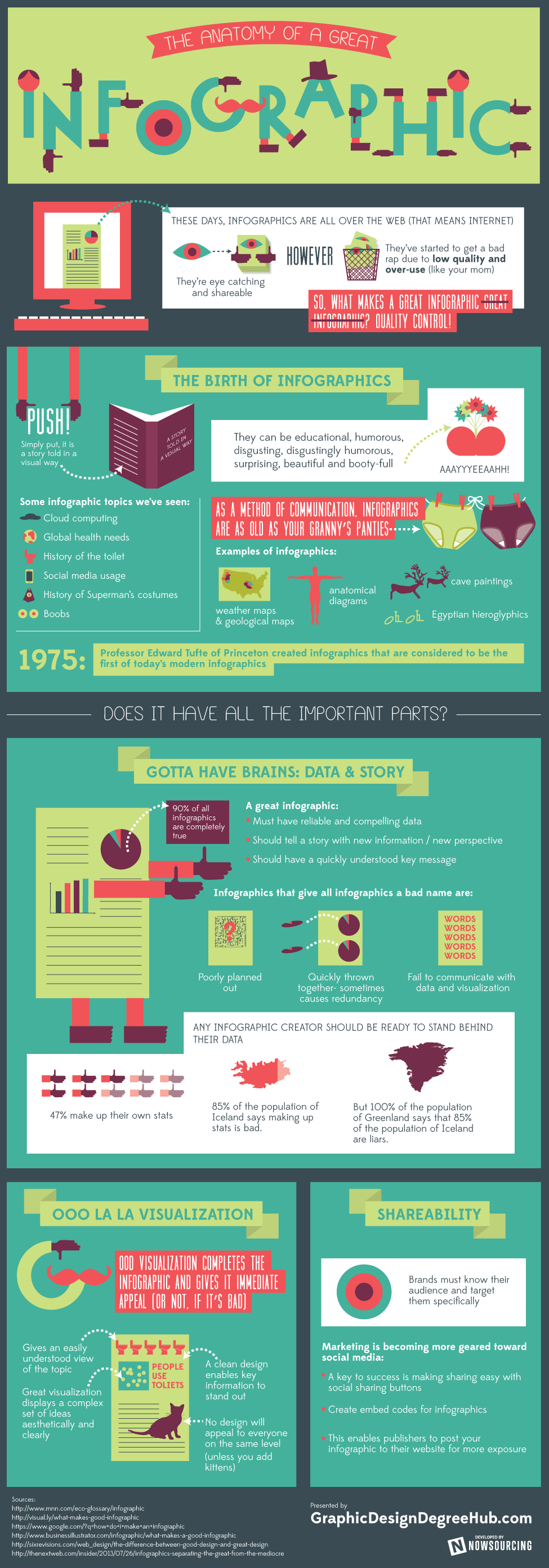
Today, “infographic” has become a generic term for all information visualizations, but the true definition of an infographic is a data visualization. They should tell a story and visually lead the audience through an organized structure of data and theories. They should also look great.
Those are just a few of the suggestions that Brian Wallace of NowSourcing, Inc. shares in an infographic his company created for Graphic Design Degree Hub. Brian explains that a great infographic offers reliable information that supports a highly focused primary message. Furthermore, that message should be communicated quickly, so the audience immediately understands the value they’ll receive from taking the time to review the infographic. Great data visualizations communicate complex data and ideas clearly and succinctly.
Take a look at The Anatomy of a Great Infographic visualization below. What makes you stop and look closely at an infographic? What makes you share an infographic with your audience?
Image source: www.graphicdesigndegreehub.com


Susan, great information here. Very well done. Here is a really basic questions: How do you actually create an info-graphic? Are there programs that create info-graphics? Thanks for this informative post.
Steven,
You can use a tool like Piktochart.com or Visual.ly. Or you can hire a designer to create your infographic for you. The choice you make depends on your budget, your technical ability, and how much time you have.